This is the third in a series of blog posts where I talk about my experiences with self-publishing and learning how to be an indie author. This post in particular was prompted by a question my friend J asked me: “Did you learn anything publishing Stormsinger that you’ll do differently in future?” Did I ever. This is just a partial list, because I’m sure there are things I’ll think about after this is published. I’ll be doing a Part Two next week, and I’ll probably have Parts Three through Six after I’ve got a couple more books published.
Cover art
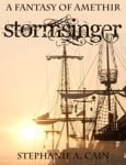
If there’s one lesson I learned about cover art, it’s this: Fall in love. Honestly, for an 8-hour e-book, I think Stormsinger has a great cover. I remembered a photo I had liked from a stock photo website. I cropped it the way I liked it (not the standard size, unfortunately), and slapped the text on there in Photoshop Elements.  Would I do it again? If I were constrained to 8 hours for writing, editing, formatting, and publishing, sure.
But the thing is, people judge books by their covers. You do it. I do it. It’s instinctive. And while I’m perfectly open to reading work by indie authors these days, I have a knee-jerk reaction to cover art that screams self-pub. If an author doesn’t care enough to get the cover right, I figure he or she doesn’t care enough to get the inside right either. Do I know that authors have more control over words than art? Of course! I routinely doodle things and wish I were good at drawing. But while I make a decent teammate at Pictionary, I would never beat a fifth-grade art student in a contest.
So no, it isn’t easy to get good cover art for your book. But it is necessary. So when I decided to invest more money and effort in Stormshadow, I spent several hours on websites like DeviantArt, looking for art I liked and scrolling through each artist’s portfolio. I bookmarked those who were available for commission, but when I found Phuoc Quan, I fell in love. His style, his subject matter, his color palettes, they were all exactly what I wanted for my book covers. Thankfully, he was available for commission, and on top of that, he’s a dream to work with.
Here’s another piece of advice regarding cover art: If you can do the actual design work yourself (text, spine label, back matter, bar code, etc), do so. But get the cover dimensions right. Either download a template if possible (CreateSpace has them for their print covers) or at least check the preferred dimensions of each e-book retailer. Derek Murphy over at CreativIndie has compiled those. He does a lot with book covers. If you don’t feel comfortable doing the design work, check out his premade covers. And if you can’t do the design work yourself, either barter with or hire a graphic designer to do it for you. Like I said, I’m totally judging your book by its cover.
Fonts
Along with cover art, I should mention, at least briefly, font choice. Others have talked about this with more knowledge and depth (Derek Murphy at CreativIndie, for one), but I have two specific pieces of advice.
Make sure you understand the license of the fonts you use. Just because you’ve chosen to self-pub, you aren’t entitled to ignore copyright laws. Make sure the font you’re using is one that you are licensed to use. If it’s one you’ve downloaded from those marvelous font repositories, it probably came with a TXT file outlining what you may and may not use it for. Full disclosure: I used the Angelic War font on both Stormsinger and Stormshadow. It wasn’t until I was formatting Stormshadow that I thought to check the license and realized I had used it for a commercial project without purchasing it. I purchased the license that day, but still felt guilty.
Make sure you love the font enough to keep using it in your series. When I published Stormsinger, I didn’t know it was going to demand an immediate sequel, but I did know there would be books set in that same world. I still love Angelic War. I also love its partner Angelic Peace. And I would choose them again if I had it to do over. But there are some fonts out there that just don’t make for a good series font. Okay, I guess I have a third piece of advice. Avoid Comic Sans.
Formatting
Make use of styles. I formatted in Word, and Smashwords has a great walk-through guide in how to format for their “meatgrinder” e-book creater. What I didn’t know when I did Stormsinger was that Word styles can be a great way to format print books for CreateSpace as well. This is a lesson I got from Laura VanArendonk Baugh, who even formatted her nonfiction book in Word.
Look at traditionally-published books. This seems like a no-brainer, but maybe it needs to be said. When I began working on the print formatting of Stormshadow, I flipped through several books from my bookshelf. I didn’t choose them at random. I picked books in the epic fantasy genre, books that were published in the last ten years, and primarily looked at hardcover and trade paper. Writers are used to manuscript format by now–double-spaced, typed, 1-inch margins, yadda yadda. But we don’t think much about how an actual book is constructed. Some books actually have information about the typeface in them (Elizabeth Moon’s most recent in the Paladin’s Legacy does, for instance). But here are a few things all books have in common:
- Title page (with publisher logo)
- Cataloging & ISBN information page
- Dedication page
- Acknowledgments
- About the author
- Some (mostly nonfiction) also have a table of contents and index
The more of these common elements you have, the more your self-published book will look like an “actual” book. Pay attention to line spacing, font size, and justification, too. Traditionally published books have full justification and are printed at maybe 1.5 spacing, but probably less. And the font size is smaller than you think it should be, too. This is one of those places where you can be creative and please yourself, but keep in mind, other people have to read it. If you’re writing a book that mostly appeals to people who need large print, by all means, go for it! But if your demographic is YA, you might want to reconsider.

In the bullet list above, I mention having a publisher logo. Derek Murphy wrote a great article at CreativIndie about this that got me thinking. I consulted a couple of people, looked into the process of creating a business in Indiana (not hard), and decided I would become Cathartes Press. I took a photo, vectored the crap out of it in Adobe Illustrator, and presto! I have a logo. Do people know who Cathartes Press is? Nope. Do they care? Also nope. It looks legit, simply by virtue of having a logo. Seriously. Read Murphy’s post.
To Be Continued…
So there you have it. Some of the lessons I’ve learned over the past eleven months since I started on my indie odyssey and became a self-published writer. Next week I’ll talk about pricing and marketing, which are topics so broad others have written entire books about them. In the meantime, what lessons have you learned from self-publishing?


